Descriptive statistics and visualization in R
By Javier Tamayo-Leiva
- 18 minutes read - 3788 wordsTable of Content
- Introduction
- Loading your data in R
- Descriptive statistics with {stat} in R
- Plot your data with {ggplot2}
- Complete your analysis with {ggpubr}
- Final plot
Introduction
I have often seen that people are interested in learning R because of the visualizations that can be generated with packages like {ggplot2}. However, R is a programming language, so its power is not only limited to that, but it is also a powerful tool for statistical analysis. Therefore, the main goal of this post is to provide tools to generate descriptive statistical analysis, and associated visualizations. This will allow us to better explore our data in search of patterns. Thus, here you will follow a step-by-step guide to perform descriptive statistical analysis and generate visualizations of your data to help you understand it better.
Loading your data in R
R has different methods when loading datasets, however with the use of an IDE (Integrated Development Environment) such as RStudio, we can simplify this process a lot.
The first thing we have to do once we have installed R and RStudio, is to install the library {readR} from {tidyverse} to help us with data loading. To do this we must execute the following code in our R session.
# Install all {tidyverse} packages (Recommended)
install.packages("tidyverse")

# Install just {readR}
install.packages("readr")
How to load the data from RStudio?
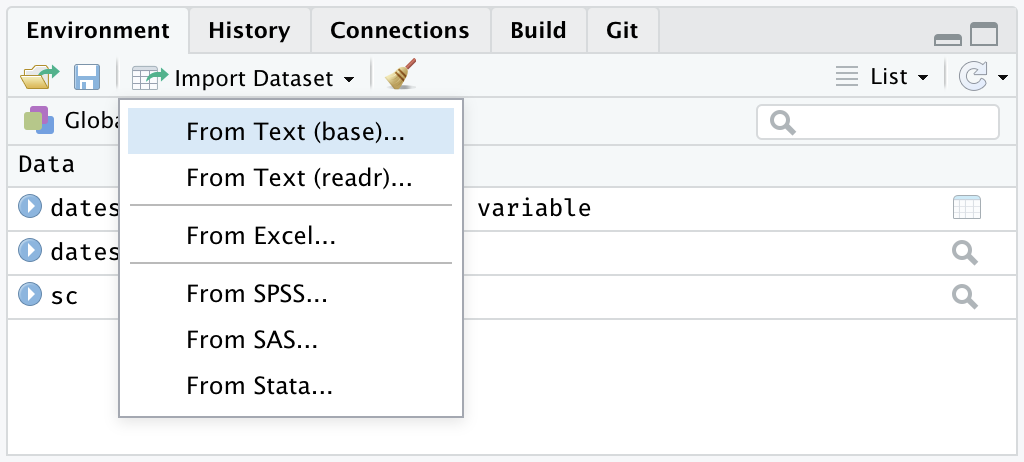
Once we have installed our packages, what we have to do in RStudio is to go to the “Environment” tab and then click on the drop down menu in the “Import dataset” tab. In this tab we will be able to select if we want to import our data from a text file (e.g. csv, tsv, etc.) or if we want to import from an Excel file (e.g. xlsx).
Environment -> Import Dataset -> From text (base), From text (readr), or From Excel
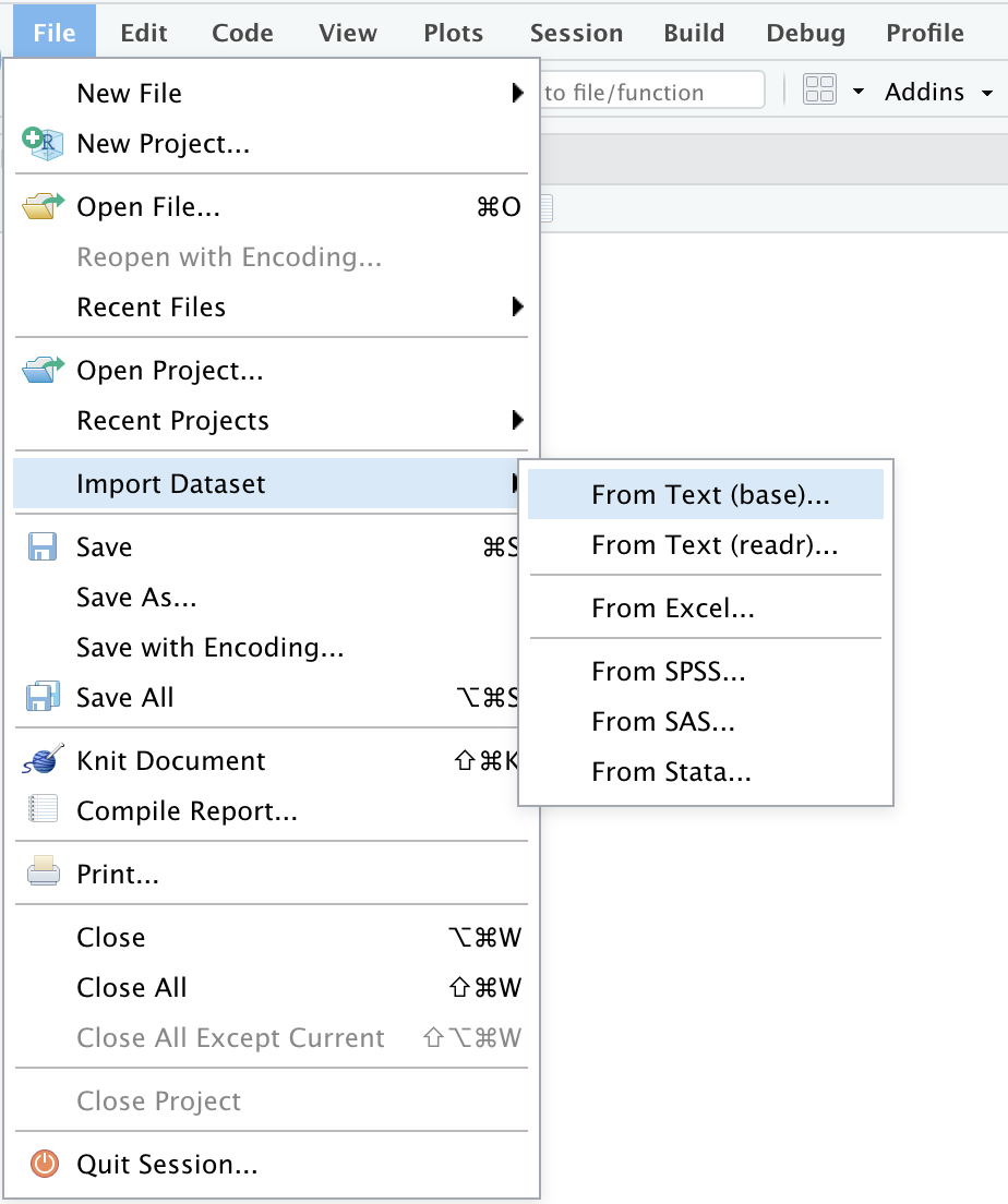
Similarly, the Import Dataset tab can be found by looking for the File tab directly in the menu at the top.
File -> Import Dataset -> From text (base), From text (readr), o From Excel
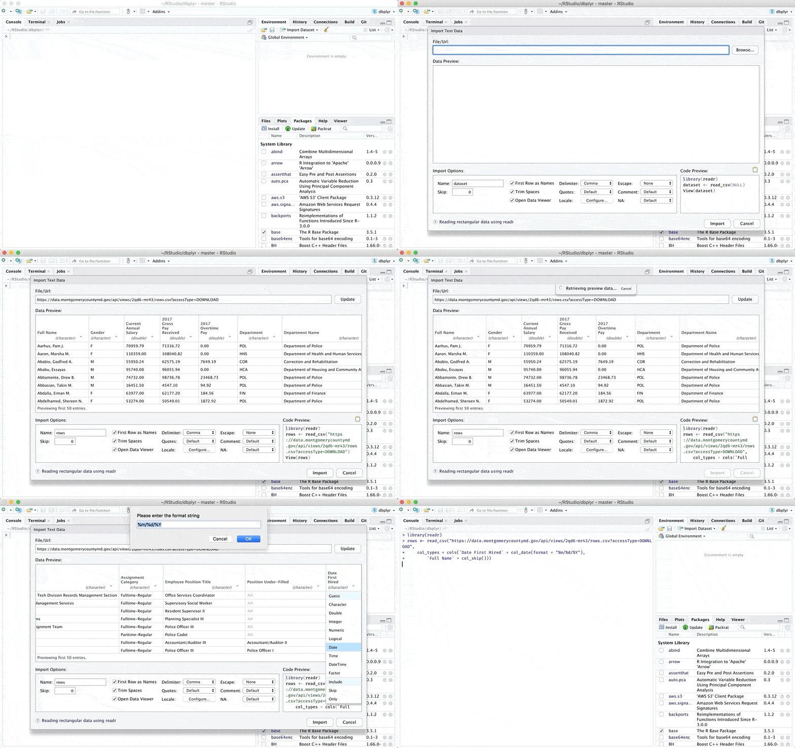
Once we have completed these steps, a window will be displayed where we can review our data of interest and where we can even make some modifications manually. You can find more details about the types of files you can upload and the modifications you can make in the original RStudio article which can be found in the following link.
Additionally there are other options to load data in R, if you are interested you can check another alternative in one of my previous posts From data loading to visualization in R (easily)
Descriptive statistics with {stat} in R
{stat} is an R package that is loaded by default at login (it is not necessary to call the library to use it). Its purpose is to provide tools for performing statistical calculations (from basic to advanced), and number set generation. For information on the functions that the {stat} package can perform, you can run the following code in your R session.
library(help = "stats")For today’s example we will use the penguins dataset that you can download by clicking on the following link: penguins.csv
Below we can review the structure of the penguin dataset.
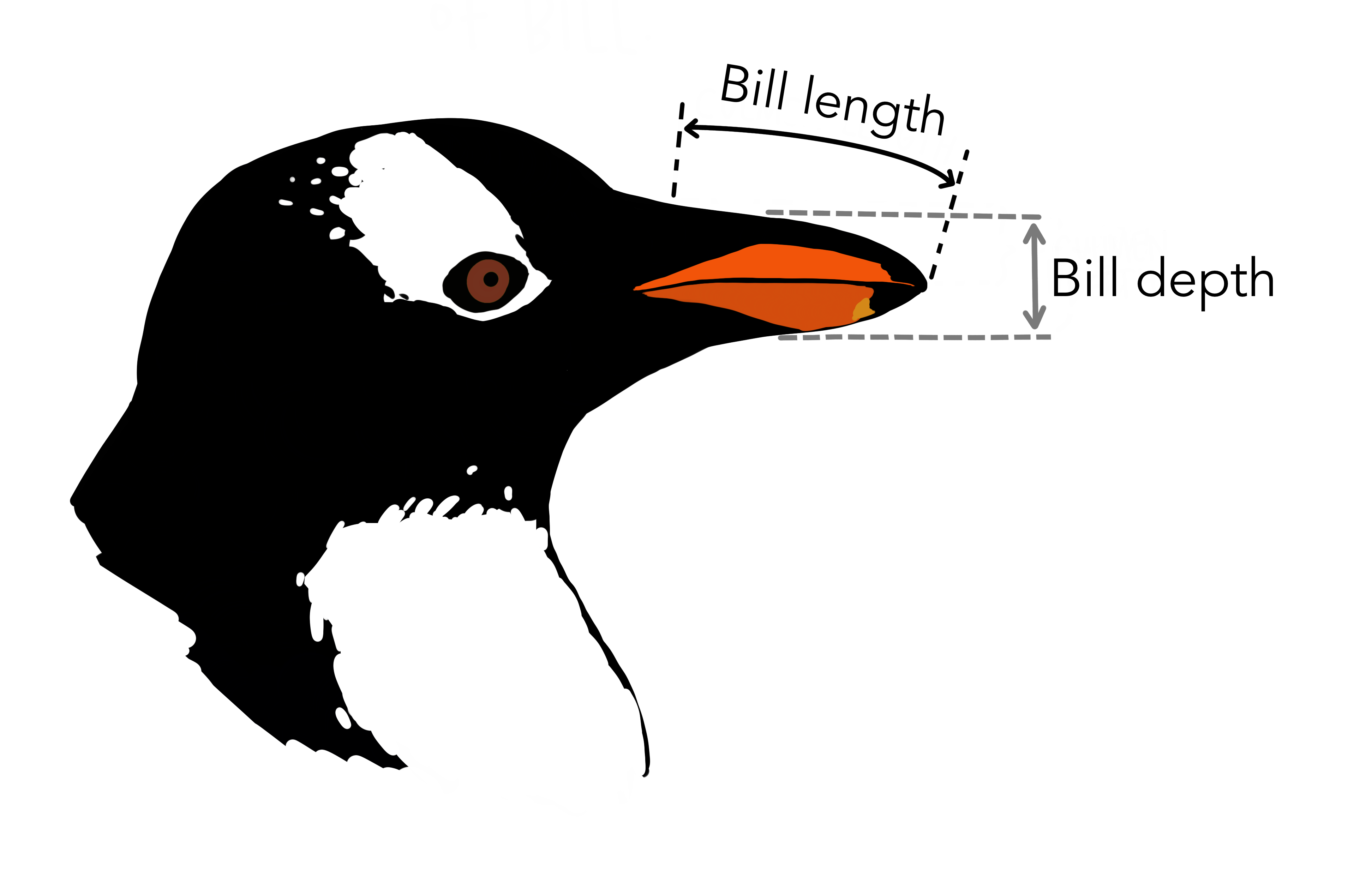
Among all the variables, for our analysis we will select “bill_length_mm” ( bill length in millimeters) and “bill_depth_mm” (bill depth in millimeters) because they are continuous variables.
Central tendency measures
The first and simplest analysis corresponds to the calculation of the mean (mean). It is necessary to note that the first argument corresponds to the data set and the variable we want to analyze (penguins$bill_length_mm). Our second argument is na.rm = TRUE to remove any observations with NA from the variable of interest in the analysis.
mean(penguins$bill_length_mm, na.rm = TRUE)## [1] 43.92193We can also calculate the median (value that separates the upper and lower 50%) in the same way, we just need to change the function to median.
median(penguins$bill_length_mm, na.rm = TRUE)## [1] 44.45Dispersion measures
We can calculate the minimum (min), maximum (max) and range (range min - max) of a continuous variable.
min(penguins$bill_length_mm, na.rm = TRUE)## [1] 32.1max(penguins$bill_length_mm, na.rm = TRUE)## [1] 59.6range(penguins$bill_length_mm, na.rm = TRUE)## [1] 32.1 59.6We can calculate the quantiles (values that divide the distribution into n regular intervals) of a continuous variable. In this example we will use the quartiles 0.25 (Q1), 0.5 (Q2) and 0.75 (Q3).
quantile(penguins$bill_length_mm, prob = c(0.25, 0.5, 0.75), na.rm = TRUE)## 25% 50% 75%
## 39.225 44.450 48.500In the same way we can calculate measures of dispersion for our data, such as variance, standard deviation.
var(penguins$bill_length_mm, na.rm = TRUE)## [1] 29.80705sd(penguins$bill_length_mm, na.rm = TRUE)## [1] 5.459584Finally, {stat} has a function that allows us to calculate all these metrics (mean, median, 0.25 (Q1) and 0.75 (Q3) quartiles, min, max, NA’s) on each variable present in a dataset. The function is called summary and is handled as follows.
summary(penguins$bill_length_mm)## Min. 1st Qu. Median Mean 3rd Qu. Max. NA's
## 32.10 39.23 44.45 43.92 48.50 59.60 2If you want to calculate it on all variables (continuous and discrete) of the data set, use the following code.
summary(penguins)Distribution measures
With {stat} we can also analyze the distribution of our data with measures that allow us to test for normality and homoscedasticity.
Shapiro-Wilk normality test:
It is used to test the normality in the distribution of the data for a variable. It can be used in groups with no more than 5000 observations (N < 5000).
Hypothesis
- H0 = The variable shows a normal distribution
- H1 = The variable does not show a normal distribution
Interpretation
- p-value > alfa: Do not reject H0 (normal)
- p-value < alfa: Reject H0 (not normal)
Note
hypothetical alpha 5% (0,05)
shapiro.test(penguins$bill_length_mm)##
## Shapiro-Wilk normality test
##
## data: penguins$bill_length_mm
## W = 0.97485, p-value = 1.12e-05Bartlett homoscedasticity test
It is used to test for homogeneity of variance (homoscedasticity) in k groups of samples, where k can be greater than two. It is adapted for normally distributed data.
Hypothesis
- H0 = Groups show homoscedasticity
- H1 = Groups (at least 2) do not show homoscedasticity.
Interpretación
- p-value > alfa: Do not reject H0 (homocedastics)
- p-value < alfa: Reject H0 (not homocedastics)
# Una variable independiente
bartlett.test(bill_length_mm ~ sex, data = penguins)
##
## Bartlett test of homogeneity of variances
##
## data: bill_length_mm by sex
## Bartlett's K-squared = 1.3429, df = 1, p-value = 0.2465# Múltiples variables independientes
bartlett.test(bill_length_mm ~ interaction(sex,species), data = penguins)##
## Bartlett test of homogeneity of variances
##
## data: bill_length_mm by interaction(sex, species)
## Bartlett's K-squared = 22.178, df = 5, p-value = 0.0004843Fligner-Killeen homoscedasticity test
To test homoscedasticity in k groups of samples, where k can be greater than two. More robust against deviations from normality or when there are problems related to outliers.
Hypothesis
- H0 = Groups show homoscedasticity
- H1 = Groups (at least 2) do not show homoscedasticity.
Interpretación
- p-value > alfa: Do not reject H0 (homocedastics)
- p-value < alfa: Reject H0 (not homocedastics)
# One independent variable
fligner.test(bill_length_mm ~ sex, data = penguins)
##
## Fligner-Killeen test of homogeneity of variances
##
## data: bill_length_mm by sex
## Fligner-Killeen:med chi-squared = 3.0297, df = 1, p-value = 0.08175# Multiple independent variables
fligner.test(bill_length_mm ~ interaction(sex,species), data = penguins)##
## Fligner-Killeen test of homogeneity of variances
##
## data: bill_length_mm by interaction(sex, species)
## Fligner-Killeen:med chi-squared = 5.9733, df = 5, p-value = 0.3088Variance analysis
These are a set of analyses that make it possible to examine whether the means of groups (populations, samples) differ from each other. There are methods that differ in the number of groups they can compare. In addition, there are parametric methods (which require the assumptions to be met) and non-parametric methods (which do not require all assumptions to be met) that are more robust to non-compliance with some of the three assumptions in the data.
Assumptions
- Independence (observations are independent of each other)
- Normality (the elements of a sample have a normal distribution)
- Homoscedasticity (variance of groups are similar)
ANOVA (One-way)
ANOVA is a statistical technique used to compare the means of two or more groups. ANOVA requires that the groups meet the 3 assumptions.
Important!
It is worth noting that none of the continuous variables in our dataset penguins has a normal distribution, so in this example we will use the variable bill_length_mm only for demonstrative purposes, and considering that the result obtained is not reliable.
peng.aov <- aov(bill_length_mm ~ species, data = penguins)
summary(peng.aov)
## Df Sum Sq Mean Sq F value Pr(>F)
## species 2 7194 3597 410.6 <2e-16 ***
## Residuals 339 2970 9
## ---
## Signif. codes: 0 '***' 0.001 '**' 0.01 '*' 0.05 '.' 0.1 ' ' 1
## 2 observations deleted due to missingnessPost-Hoc test for ANOVA
Tukey’s HSD (honestly significant difference) test
TukeyHSD(peng.aov)## Tukey multiple comparisons of means
## 95% family-wise confidence level
##
## Fit: aov(formula = bill_length_mm ~ species, data = penguins)
##
## $species
## diff lwr upr p adj
## Chinstrap-Adelie 10.042433 9.024859 11.0600064 0.0000000
## Gentoo-Adelie 8.713487 7.867194 9.5597807 0.0000000
## Gentoo-Chinstrap -1.328945 -2.381868 -0.2760231 0.0088993ANOVA (two-way)
Two-way ANOVA allows us to analyze the variance in the mean between groups when there is interaction between two different categorical and independent variables.
peng.aov2 <- aov(bill_length_mm ~ species*sex, data = penguins)
summary(peng.aov2)
## Df Sum Sq Mean Sq F value Pr(>F)
## species 2 7015 3508 654.189 <2e-16 ***
## sex 1 1136 1136 211.807 <2e-16 ***
## species:sex 2 24 12 2.284 0.103
## Residuals 327 1753 5
## ---
## Signif. codes: 0 '***' 0.001 '**' 0.01 '*' 0.05 '.' 0.1 ' ' 1
## 11 observations deleted due to missingnessTukeyHSD(peng.aov2)## Tukey multiple comparisons of means
## 95% family-wise confidence level
##
## Fit: aov(formula = bill_length_mm ~ species * sex, data = penguins)
##
## $species
## diff lwr upr p adj
## Chinstrap-Adelie 10.009851 9.209424 10.8102782 0.0000000
## Gentoo-Adelie 8.744095 8.070779 9.4174106 0.0000000
## Gentoo-Chinstrap -1.265756 -2.094535 -0.4369773 0.0010847
##
## $sex
## diff lwr upr p adj
## MALE-FEMALE 3.693368 3.194089 4.192646 0
##
## $`species:sex`
## diff lwr upr p adj
## Chinstrap:FEMALE-Adelie:FEMALE 9.315995 7.937732 10.6942588 0.0000000
## Gentoo:FEMALE-Adelie:FEMALE 8.306259 7.138639 9.4738788 0.0000000
## Adelie:MALE-Adelie:FEMALE 3.132877 2.034137 4.2316165 0.0000000
## Chinstrap:MALE-Adelie:FEMALE 13.836583 12.458320 15.2148470 0.0000000
## Gentoo:MALE-Adelie:FEMALE 12.216236 11.064727 13.3677453 0.0000000
## Gentoo:FEMALE-Chinstrap:FEMALE -1.009736 -2.443514 0.4240412 0.3338130
## Adelie:MALE-Chinstrap:FEMALE -6.183118 -7.561382 -4.8048548 0.0000000
## Chinstrap:MALE-Chinstrap:FEMALE 4.520588 2.910622 6.1305547 0.0000000
## Gentoo:MALE-Chinstrap:FEMALE 2.900241 1.479553 4.3209291 0.0000002
## Adelie:MALE-Gentoo:FEMALE -5.173382 -6.341002 -4.0057622 0.0000000
## Chinstrap:MALE-Gentoo:FEMALE 5.530325 4.096547 6.9641020 0.0000000
## Gentoo:MALE-Gentoo:FEMALE 3.909977 2.692570 5.1273846 0.0000000
## Chinstrap:MALE-Adelie:MALE 10.703707 9.325443 12.0819703 0.0000000
## Gentoo:MALE-Adelie:MALE 9.083360 7.931851 10.2348686 0.0000000
## Gentoo:MALE-Chinstrap:MALE -1.620347 -3.041035 -0.1996591 0.0149963Kruskal-Wallis
Kruskal-Wallis test is a statistical and nonparametric test (it does not assume normality in the data) used to compare the means of two or more groups. It is similar to ANOVA but with data by categories.
kruskal.test(bill_length_mm ~ species, data = penguins)##
## Kruskal-Wallis rank sum test
##
## data: bill_length_mm by species
## Kruskal-Wallis chi-squared = 244.14, df = 2, p-value < 2.2e-16Post-Hoc test for Kruskal-Wallis
Mann–Whitney–Wilcoxon o Wilcoxon rank-sum test
pairwise.wilcox.test(penguins$bill_length_mm, penguins$species, p.adjust.method="fdr")##
## Pairwise comparisons using Wilcoxon rank sum test with continuity correction
##
## data: penguins$bill_length_mm and penguins$species
##
## Adelie Chinstrap
## Chinstrap <2e-16 -
## Gentoo <2e-16 0.0018
##
## P value adjustment method: fdrPlot your data with {ggplot2}
{ggplot2} it is an R package oriented to data visualization. It was created by Hadley Wickham in 2005 and is based on Leland Wilkinson’s “Grammar of Graphics”. Briefly, the “Grammar of Graphics” is a general approach to data visualization, where a graph is separated into semantic components such as scales and layers.
So, if we have not yet installed {ggplot2}, what we have to do in RStudio is to install and load the {ggplot2} library with the following code:
- Install the complete Tidyverse package library (recommended)
# Install from CRAN (The Comprehensive R Archive Network)
install.packages("tidyverse")
# Load libraries
library(tidyverse)- Install only the library {ggplot2}
# Install from CRAN
install.packages("ggplot2")
# Load library
library(ggplot2)
Basic plot
The first graph we will create corresponds to a density graph (selected through the geom_density object). For this we will only need a continuous variable (x = bill_length_mm), since ggplot2 will generate the rest of the necessary information through transformations and statistical calculations. This way you will not have to generate any manipulation to your data before plotting them.
Densiplot
ggplot(data = penguins,
       mapping = aes(x = bill_length_mm)) +
       geom_density()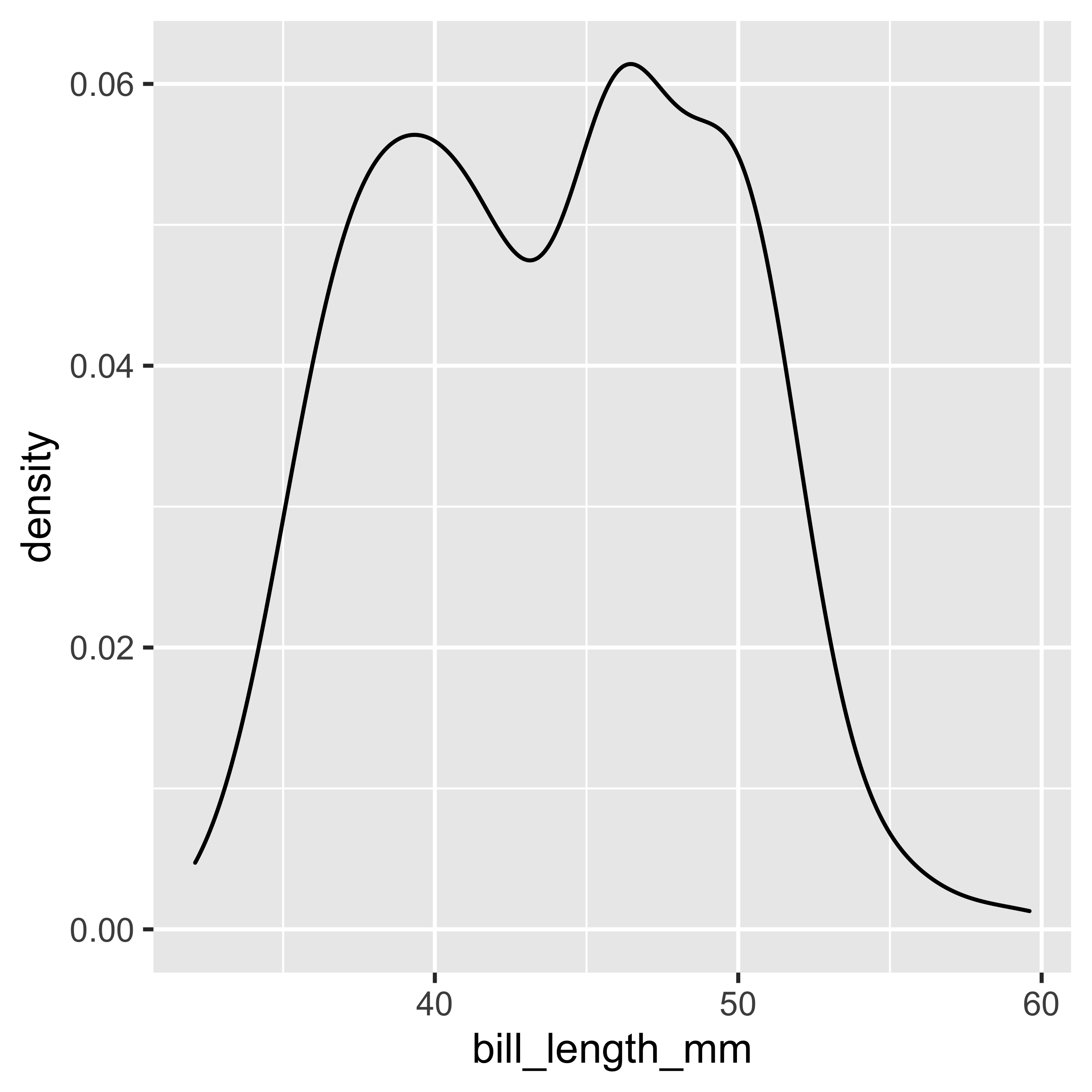
The densiplot calculates and plots the density estimate of the data (it is a smoothed version of the histogram). A densiplot allows us to see the distribution of our data, and the area under the densiplot curve adds up to 1 which corresponds to the probability of finding 100% of our observations.
The {ggplot2} package, allows us to perform several types of visualizations due to the large variety of geom objects. As we have already reviewed our data set “penguins”, and we have identified continuous variables such as “bill_length_mm” (peak length in millimeters) and “bill_depth_mm” (peak depth in millimeters). Next we will make a point plot (selected through the geom_point object), where we will map two variables (i.e. x and y) and not only one (i.e. x) as in the previous example. To do this, we will map bill_length_mm to the x axis, and bill_depth_mm to the y axis.
Scatterplot
ggplot(data = penguins,
       mapping = aes(x = bill_length_mm,
                     y = bill_depth_mm)) +
       geom_point()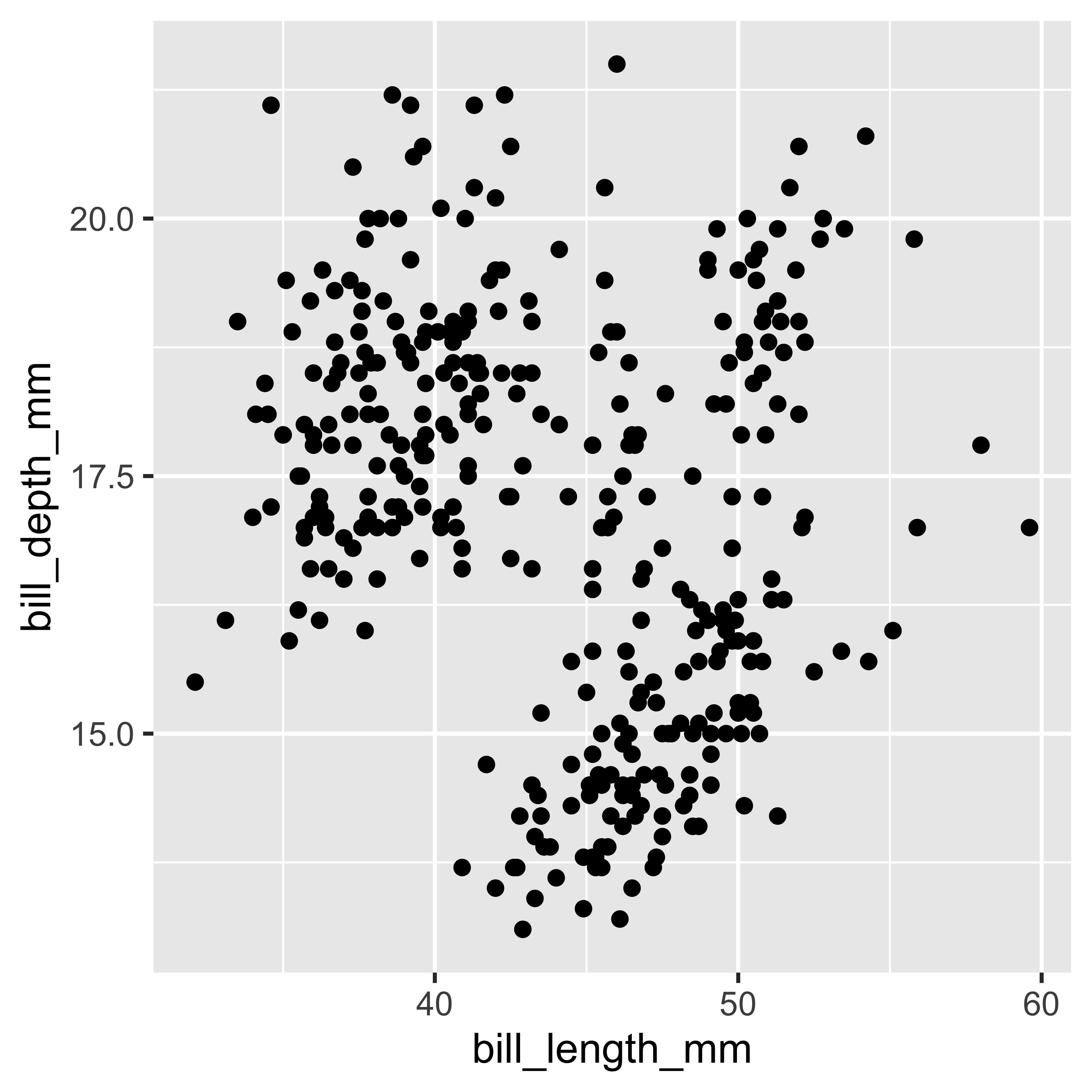
Components of a plot in {ggplot2}
ggplot(): It is the function that creates a coordinate system - in general form, i.e. for all later incorporated layers - that will be incorporated into the layers. The first argument of the function is the data set (data =). By itself this function does not generate a layer, but it provides all the information needed to add one.data: The dataset (in this case penguins) is a rectangular collection of data with the variables (columns) and their observations/values (rows) to be mapped.mapping (
aes()) : This is where you specify the set of variables and observations that are “mapped” or assigned to the visual properties to be used in the graph and which axes to assign to these values (x = bill_length_mm,y = bill_depth_mm). If they are not specified -in general-, they must be indicated in each layer added to the chart.geom_point(): The plot layers are incorporated by Geom functions. In this case the function adds a layer of points to the plot (i.e., scatterplot). ggplot2 includes more than 30 geom functions, in addition to those developed by other authors.
Choosing Colors
The above graph only allows us to see the relationship between two continuous numerical variables. However, the data set also has information assigned to discrete groups such as species and sex of the penguin. For this reason we will use another visual property such as color to incorporate a new layer of information in the graph. For this we will use the color argument inside the variables mapped in aes(...).
ggplot(data = penguins,
       mapping = aes(x = bill_length_mm,
                     y = bill_depth_mm,
                     color = species)) +
       geom_point()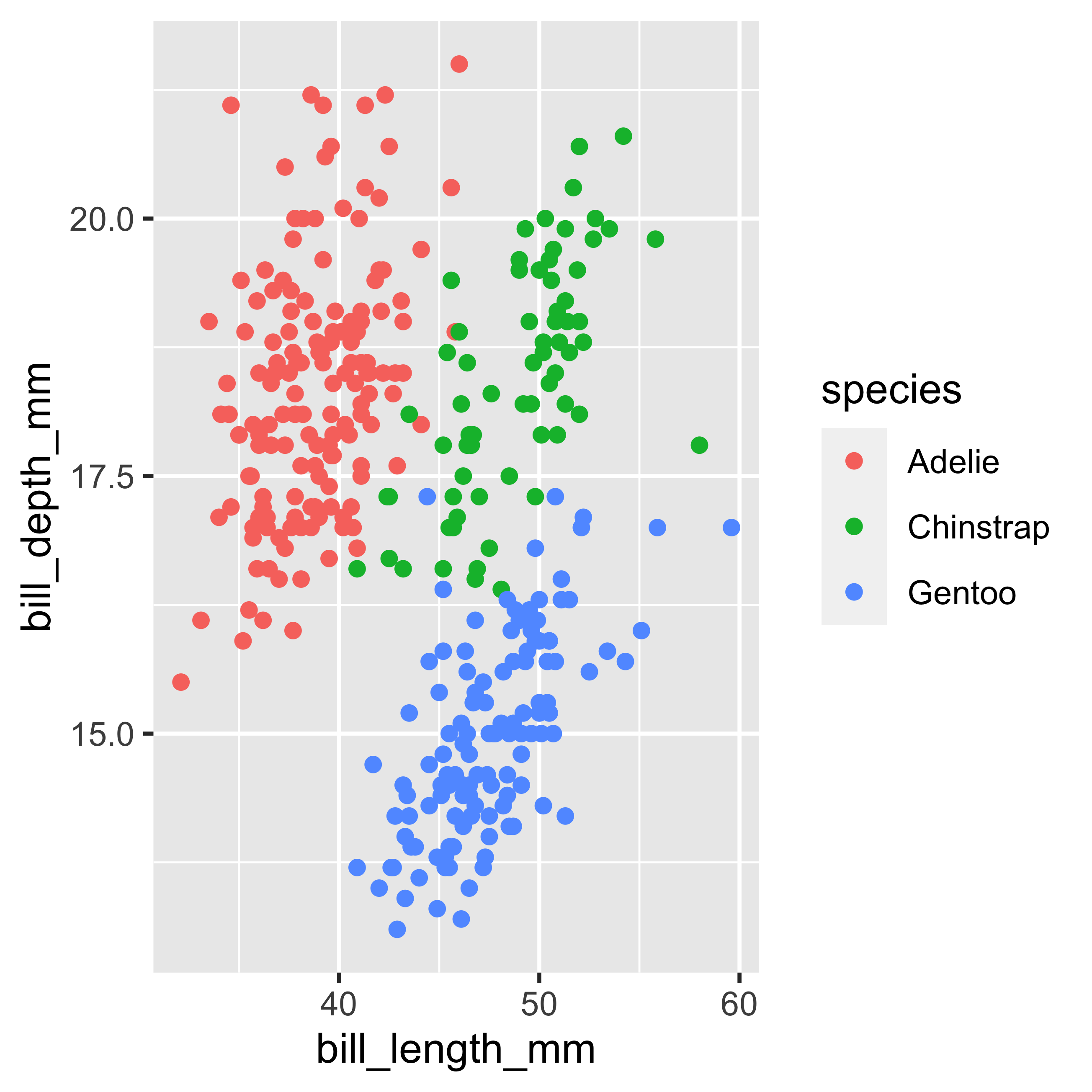
Choose the graphic with the geom objects
A layer in ggplot2, combines data, visual properties, geometric objects (Geoms), statistical functions and/or transformations (Stat), and position adjustment. In our previous plots we have made a density plot or densiplot and a point plot or scatterplot. By default in R you have to choose a geom_... object to generate a visualization, otherwise we will get a representation without our data in it.
In the previous graph we can see that there are differences in the distribution of the data according to species. We will now choose another representation to better show the distribution of the continuous variable bill_length_mm as a function of the discrete groups present (species) in the data set. To do this we will change our geom from geom_point() to geom_boxplot() and geom_violin().
Boxplot
ggplot(data = penguins,
       mapping = aes(x = species,
                     y = bill_length_mm,
                     color = species)) +
       geom_boxplot()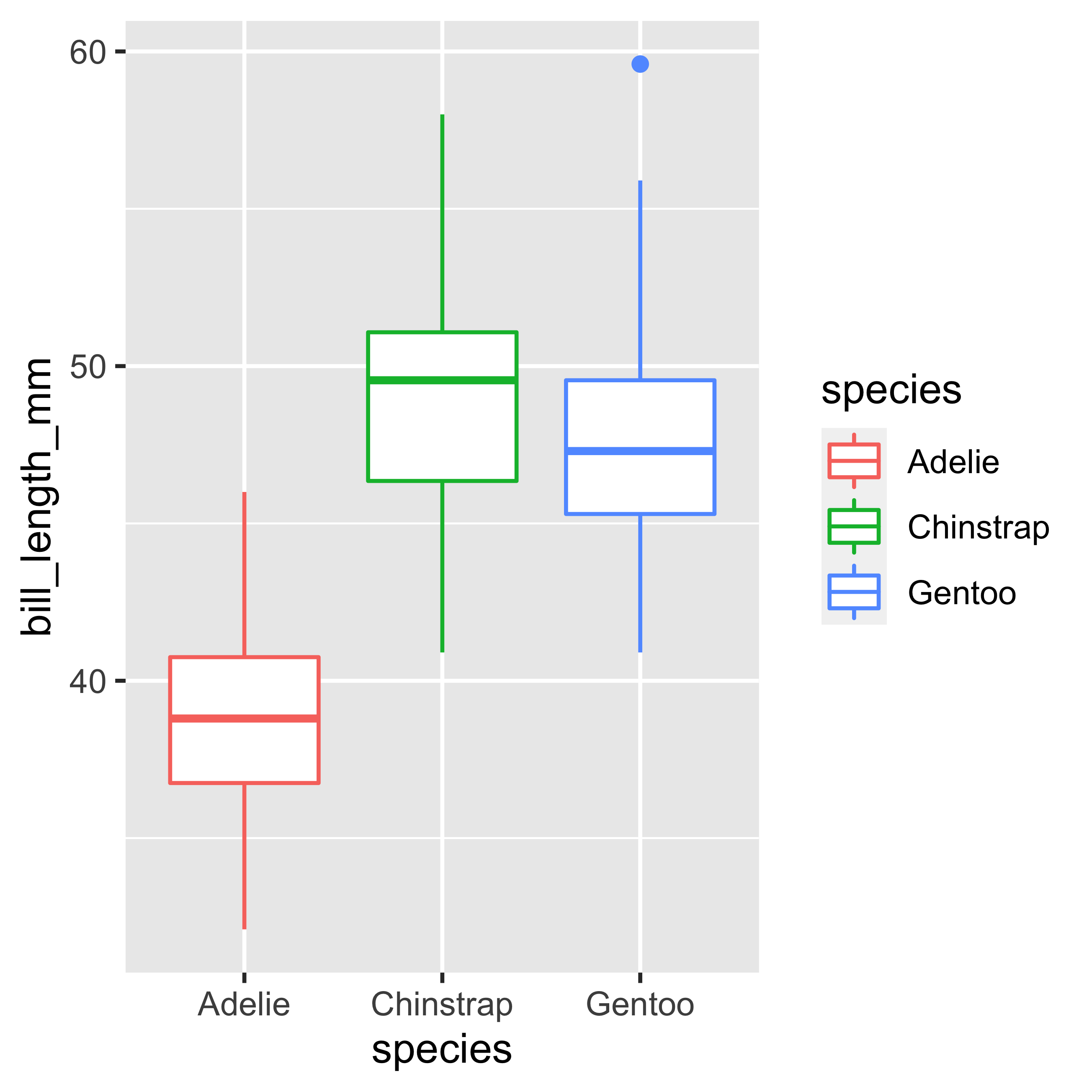
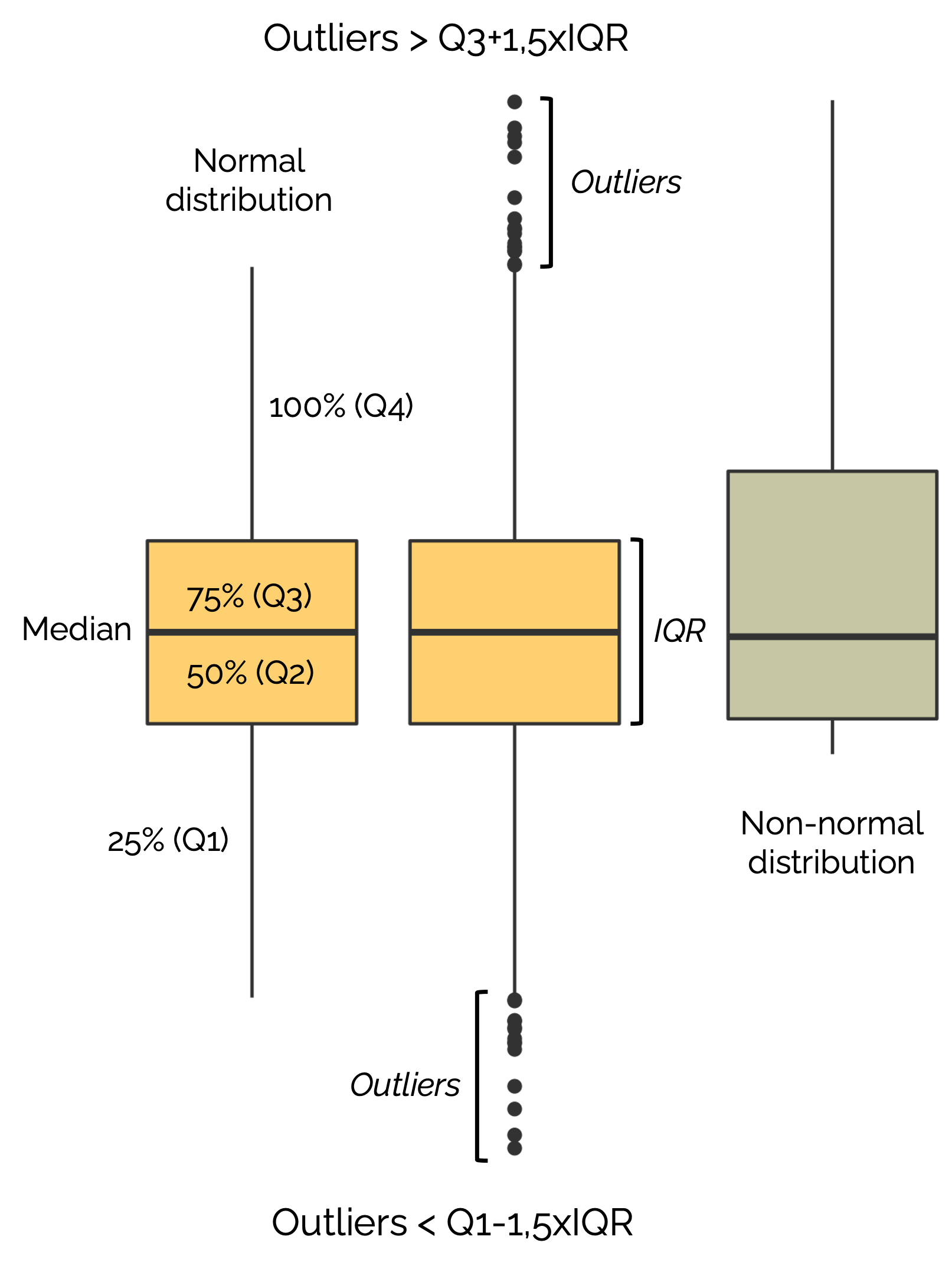
The boxplot is a very useful type of visualization because it allows us to identify in a single graph the quantiles (0.25 (Q1), 0.5 (Q2) and 0.75 (Q3)), as well as the outliers (outliers) of a data set.
How to interpret a boxplot?
Violin Plot
ggplot(data = penguins,
       mapping = aes(x = species,
                     y = bill_length_mm,
                     color = species)) +
       geom_violin()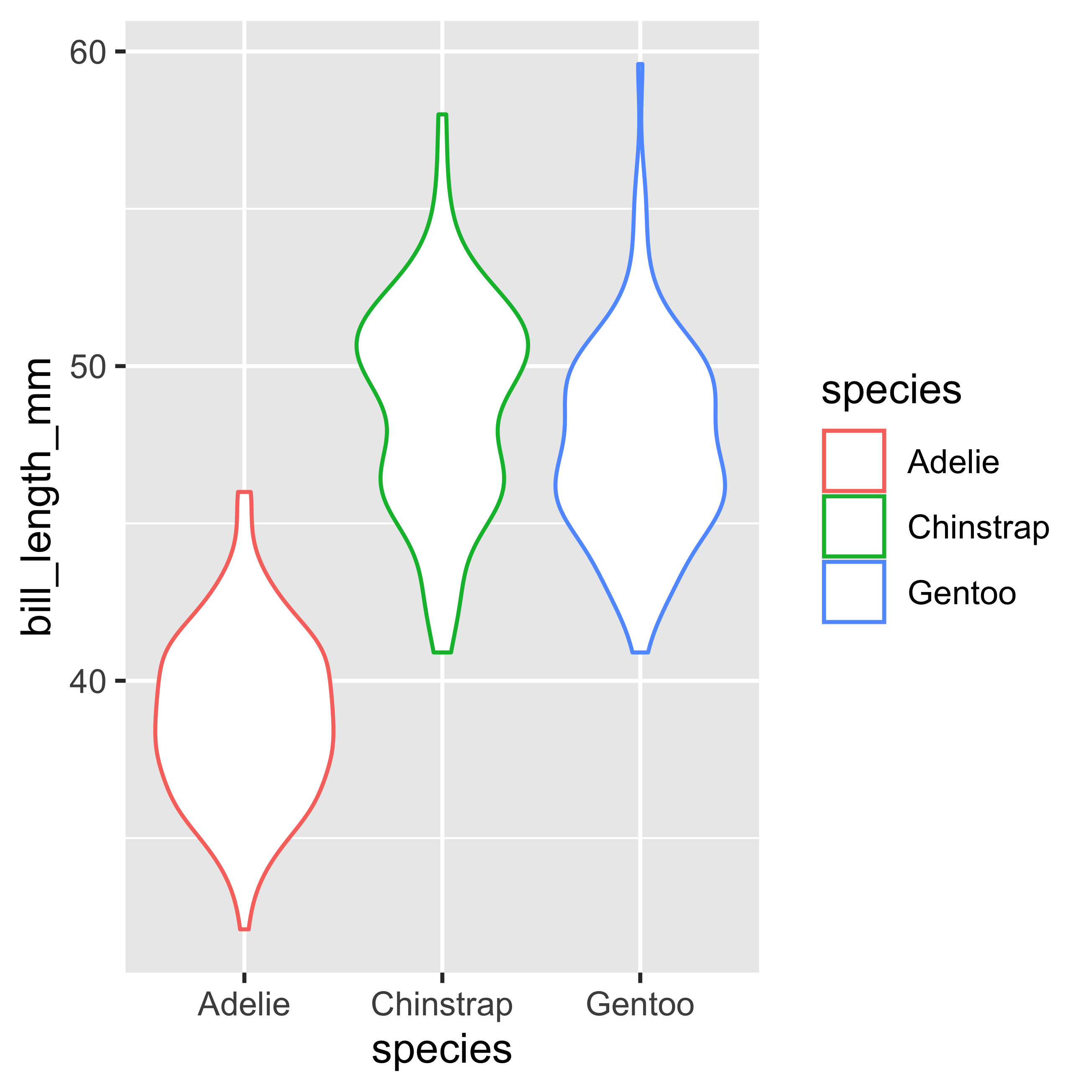
The violin plot is another type of visualization, in which we can observe the distribution of the data, allowing us to observe the density more clearly.
Complete your analysis with {ggpubr}
{ggpubr} it is an R package aimed at complementing data visualization with {ggplot2}. {ggpubr} provides easy-to-use functions that allow you to create and customize {ggplot2} plots and make them ready for publication.
So, if we have not installed {ggpubr} yet, what we have to do in RStudio is to install and load the {ggpubr} library with the following code:
# Install from CRAN
install.packages("ggpubr")
# Load library
library(ggpubr)
{ggpubr} functions
One useful function of {ggpubr} is stat_overlay_normal_density() which allows us to plot a reference normal distribution (based on our data) and compare it to the distribution of our variable of interest.
Normal distribution
ggplot(data = penguins,
       mapping = aes(x = bill_length_mm)) +
       geom_density() +
stat_overlay_normal_density(color = "darkblue", linetype = "dashed")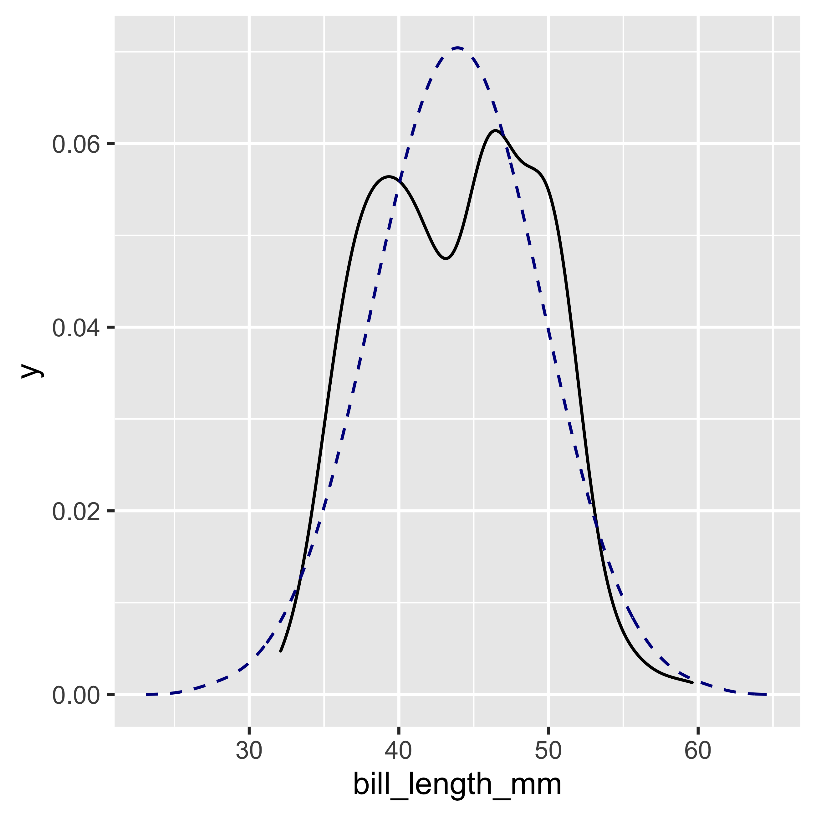
With this function we can see that our distribution is not perfectly normal, which visually verifies the result obtained previously with the Shapiro-Wilk test.
Plot an analysis of variance
The following function stat_compare_means() will allow us to perform an analysis of variance with the Kruskal-Wallis test on our boxplot. The second comparison includes the Wilcoxon post-hoc rank sum test, in the same way as we performed the previous example with the Kruskal-Wallis test. By default, the stat_compare_means() function calculates the Kruskal-Wallis test when there are 3 or more groups. The ref.group = ".all." argument refers to a comparison of all groups against all groups. The label.y argument specifies where (with respect to the y axis) our legends will be placed on the graph.
ggplot(data = penguins,
       mapping = aes(x = species,
                     y = bill_length_mm,
                     color = species)) +
       geom_boxplot() +
  stat_compare_means() +
  stat_compare_means(aes(label = ..p.signif..),
                         method = "wilcox.test",
                         ref.group = ".all.",
                         label.y = 65)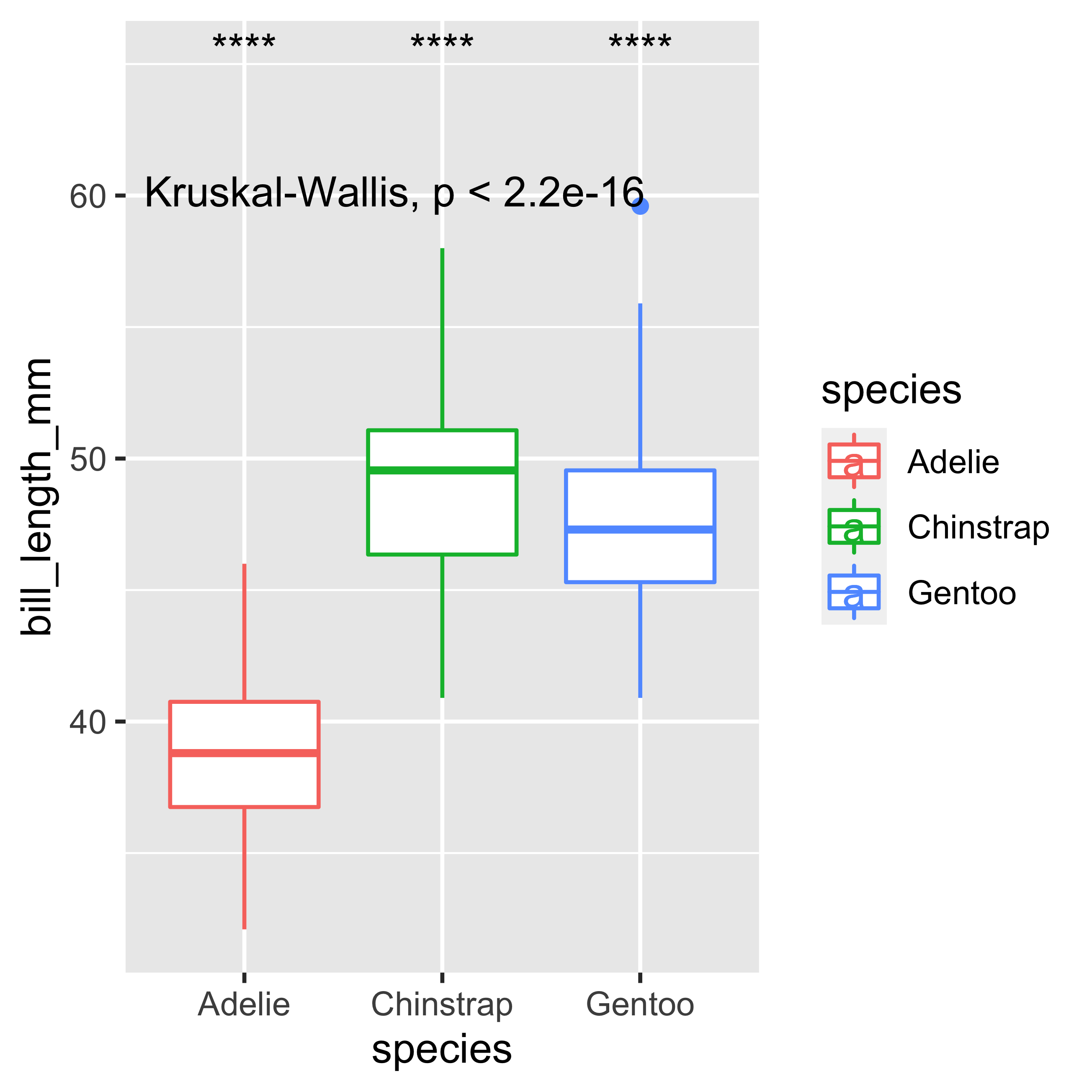
If we want to perform the ANOVA test we must follow the following code, where the paired t-test will be performed. But let’s remember that in this case our data does not comply with normality, so this example is just a demonstration of the code.
ggplot(data = penguins,
       mapping = aes(x = species,
                     y = bill_length_mm,
                     color = species)) +
       geom_boxplot() +
  stat_compare_means(method = "anova") +
  stat_compare_means(aes(label = ..p.signif..),
                         method = "t.test",
                         ref.group = ".all.",
                         label.y = 65)
Final plot
Now that we have the results of the variables we are interested in, we can focus on improving the aesthetic parameters of our visualizations. These modifications are intended to make our visualization look more attractive and professional to our future audience. Due to the construction of geom_boxplot(), when we assign the color argument, this will only be represented in the outline of the figure, so we will substitute the color argument by fill, with this simple change we will see an immediate improvement. In addition, we will modify the colors used for representing each of our three groups. For this we will use the scale_fill_manual() layer, and we will assign a list - constructed with the following syntax c(…)- of three colors with their hexadecimal codes (“#393459”, “#F2AB27”, “#D96704”) to the values argument in the function scale_fill_manual().
ggplot(data = penguins,
       mapping = aes(x = species,
                     y = bill_length_mm,
                     fill = species)) +
       geom_boxplot() +
  stat_compare_means() +
  stat_compare_means(aes(label = ..p.signif..),
                         method = "wilcox.test",
                         ref.group = ".all.",
                         label.y = 65) +
  scale_fill_manual(values = c("#393459","#F2AB27","#D96704"))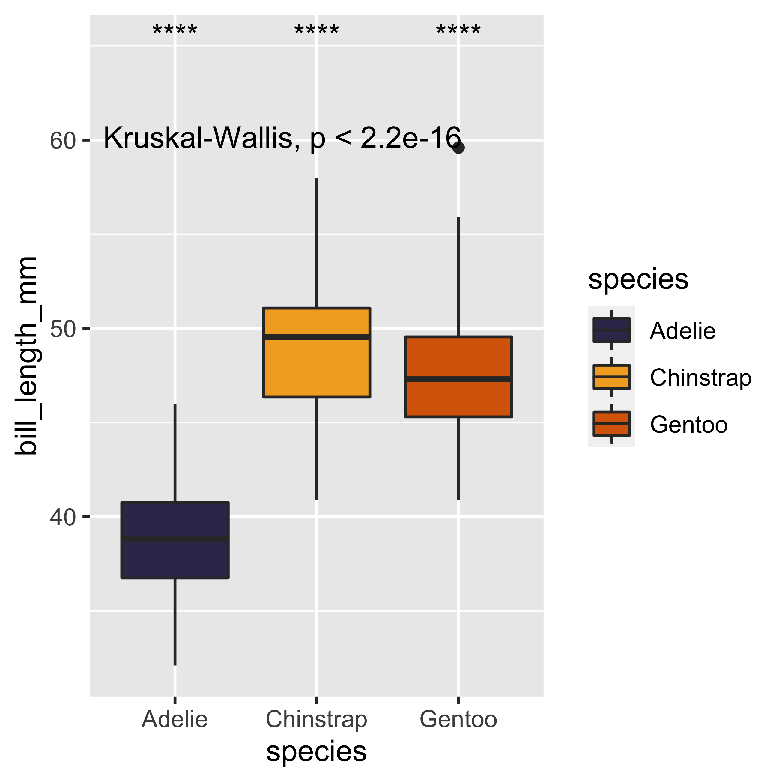
Finally, we will add legends to each axis and a title to the graph, which will help us to make the figure more self-explanatory. To do this we will use the labs() layer and change the default chart theme. Changing the theme of the chart is like changing the canvas on which we represent our data. To do this we will use the theme_pubr() function, a theme that is in the {ggpubr} library, which will give us a clean and elegant graph, ready for publication. With the addition of these last points, our basic plot now incorporates a statistical analysis of variance (Kruskal-Wallis test, and Wilcoxon rank sum test), and an aesthetic component that will make it visually more appealing and easier to interpret. Additionally, you can also create your own theme with the theme() function, but we will have to review that in more detail in a future post. For now I say goodbye and hope you have a great day!
# Basic plot
ggplot(data = penguins,
       mapping = aes(x = species,
                     y = bill_length_mm,
                     fill = species)) +
       geom_boxplot() +
# Statistical analysis of variance
  stat_compare_means() +
  stat_compare_means(aes(label = ..p.signif..),
                         method = "wilcox.test",
                         ref.group = ".all.",
                         label.y = 65) +
# Aesthetic Parameters
  scale_fill_manual(values = c("#393459","#F2AB27","#D96704")) +
  labs(x = "Penguin species",
       y = "Bill length (mm)",
       fill = "",
       title = "Penguins of the Palmer Archipelago,\nAntarctica") +
  theme_pubr()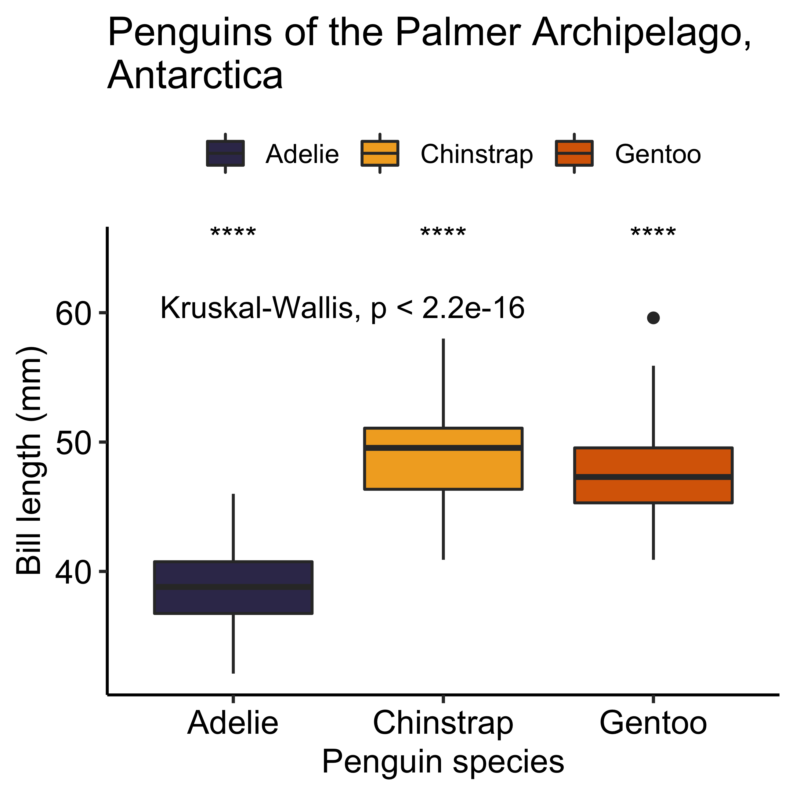
R Session Info
## R version 4.1.3 (2022-03-10)
## Platform: x86_64-apple-darwin17.0 (64-bit)
## Running under: macOS Big Sur/Monterey 10.16
##
## Matrix products: default
## BLAS:   /Library/Frameworks/R.framework/Versions/4.1/Resources/lib/libRblas.0.dylib
## LAPACK: /Library/Frameworks/R.framework/Versions/4.1/Resources/lib/libRlapack.dylib
##
## locale:
## [1] en_US.UTF-8/en_US.UTF-8/en_US.UTF-8/C/en_US.UTF-8/en_US.UTF-8
##
## attached base packages:
## [1] stats     graphics  grDevices utils     datasets  methods   base
##
## other attached packages:
##  [1] forcats_0.5.1     stringr_1.4.0     dplyr_1.0.9       purrr_0.3.4
##  [5] readr_2.1.2       tidyr_1.2.0       tibble_3.1.7      tidyverse_1.3.1
##  [9] ggpubr_0.4.0      ggplot2_3.3.6     systemfonts_1.0.4
##
## loaded via a namespace (and not attached):
##  [1] httr_1.4.3        sass_0.4.1        bit64_4.0.5       vroom_1.5.7
##  [5] jsonlite_1.8.0    carData_3.0-5     modelr_0.1.8      bslib_0.3.1
##  [9] assertthat_0.2.1  highr_0.9         cellranger_1.1.0  yaml_2.3.5
## [13] pillar_1.7.0      backports_1.4.1   glue_1.6.2        digest_0.6.29
## [17] ggsignif_0.6.3    rvest_1.0.2       colorspace_2.0-3  htmltools_0.5.2
## [21] pkgconfig_2.0.3   broom_0.7.12      haven_2.4.3       bookdown_0.24
## [25] scales_1.2.0      tzdb_0.3.0        generics_0.1.2    farver_2.1.0
## [29] car_3.0-12        ellipsis_0.3.2    DT_0.23           withr_2.5.0
## [33] cli_3.3.0         magrittr_2.0.3    crayon_1.5.1      readxl_1.3.1
## [37] evaluate_0.14     fs_1.5.2          fansi_1.0.3       rstatix_0.7.0
## [41] xml2_1.3.3        blogdown_1.8      tools_4.1.3       hms_1.1.1
## [45] lifecycle_1.0.1   munsell_0.5.0     reprex_2.0.1      compiler_4.1.3
## [49] jquerylib_0.1.4   rlang_1.0.2       grid_4.1.3        rstudioapi_0.13
## [53] htmlwidgets_1.5.4 crosstalk_1.2.0   labeling_0.4.2    rmarkdown_2.11
## [57] gtable_0.3.0      abind_1.4-5       DBI_1.1.2         curl_4.3.2
## [61] R6_2.5.1          lubridate_1.8.0   knitr_1.37        fastmap_1.1.0
## [65] bit_4.0.4         utf8_1.2.2        stringi_1.7.6     parallel_4.1.3
## [69] Rcpp_1.0.8.3      vctrs_0.4.1       dbplyr_2.1.1      tidyselect_1.1.2
## [73] xfun_0.29